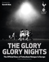
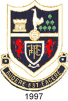
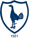
 After the intensity of the 'Roaring 20’s' series and recent Cup matches, not to mention the sad news out of the club this week for this trip down into the vaults I thought it might be an idea to look back at a slightly lighter passage in the clubs history and the club’s crest. Tottenham like most clubs had their own crest. Whilst the clubs embraced their various crests they were rarely seen on the match day shirt in their early days. They would need to be added by hand and this became a slow and expensive task especially when the shirt was torn or the colours faded with repeated washing. Tottenham did not wear a ‘club badge’ until the 1921 FA Cup Final and then the 1921/22 season (2) and even then it was the cockerel. The cockerel has appeared in various forms most seasons since then. The crest only appeared on the shirt for a short while in the late 1990’s and even then that was partly to prevent cheap ‘rip-off’ versions of replica shirts. The first Tottenham teams did wear a ‘symbol’ until the late 1880’s which I will return to but a little scene setting first, bear with me. Most clubs developed a crest in their early years. These were along heraldic guidelines. Coats of Arms date back to 11th century and were used as a means of identification when most people couldn’t read. Thus ‘supporters’ could follow their Lords into battle. Clubs tended to take local crests and adapt them adding something related to the club. India Spurs readers will be aware of the clubs history in its early days from the excellent series (4). 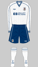 1. Between 1997-99 1. Between 1997-99 The Tottenham crest has in the top left side Bruce Castle, Bruce was a member of the Northumberland family (hence Northumberland Park). Its not so much a castle as a large house and is used today to house the local history collection. On the upper right are seven elm trees representing seven sisters (as in Seven Sisters road) there are numerous stories of who these were. These are listed at www.islingtonhistory.org.ug but vary from growing naturally to the burning of protestant martyrs, pagan rituals from Roman days or seven sisters each planting a tree upon being parted from each other. Beneath them are two lions which are taken from the Northumberland family crest. In the center is a fighting cock and this relates to the wearing of Spurs. The motto, as I am sure you will be aware, is “ Audere est facere” which is Latin for ‘to dare is to do’. 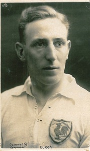 Jack Elkes Jack Elkes This again is thought to relate to the actions of Sir Henry Percy. Now if you believe either the historians or Shakespeare he put everything into his fighting and would not spare the spurs on his horse. Which is why it is Hotspur or Spurs, never Hotspurs (3). Motto's only came into fashion much later than the early crest around the 15th century. Over the years clubs have tended to drop or at least sideline the crest (1), partly due to them not being copyrighted in the first stage of their use. Some clubs such as Burnley still use theirs on their shirts. The crest would be found on jackets, ties and notepaper etc to help build an identifying loyalty factor. Whilst today a simpler badge is normally adopted to be used as an aid in a commercial setting. IS previously featured a item on early club strips (4) however whilst I was researching this article and looking at when various badges were introduced I realised that those wonderful chaps over at Historical Kits who are always looking to update their work (2) had made a number of changes to their Tottenham kits. Including the one I've included here from 1883. 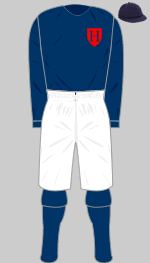 From 1883. From 1883. The first known kit (right) dates from 1883 and was blue with white shorts (5). This had a red shield with the letter H on the breast. By the middle of that decade the club adopted blue and white halves. These carried a Maltese Cross on the chest. Some sources will claim that this was to indicate Christianity. The Cross dates back to the Order of St. John and the Crusades, during the late 1800’s whilst still having a religious concatenation it had become a widely used symbol of bravely and heroic dead's. This in turn was replaced by a letter H, no shield, until 1899. From that time until the cockerel appeared the shirts were left blank. Jack Elkes above played for the club between 1923-29 and was a 'no nonsense' defender. He made over 200 appearances for Spurs. Here you can clearly with the early cockerel. Although the cockerel underwent some minor changes, mostly in the tail plumage it remained largely unchanged until the 1950’s. Its thought the cockerel did not appear on the ‘change’ strip until 1928 season. Possibly due to the expense and the rarity of the shirt being worn at a time when fewer fans traveled long distances. 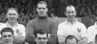 Another interesting note, as you can see from this picture (left) of Ted Ditchburn taken in 1950/51 (seen here flanked by Bill Nicholson and Ron Burgess) Goalkeepers did not wear the badge. This is of course long before the club enjoyed the income from sales of replica kits. His understudy Ron Reynolds wrote in his diaries that he was even expected to supply his own jumper. 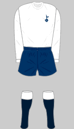 Then below in 1966 the cockerel took a step much closer to the one we now wear. Whilst it may be partly due to being the one I followed as a young fan I do feel its a much more bold, fighting stance. It would be another twenty years until sponsors names appeared on the shirts and we will return for a look at the next stage of the evolution at a later date. Notes – 1- You will also find a image of this crest as a tattoo in Talking Tottenham 44. 2- You will have noticed in the recent Tottenham and the Roaring 20’s series how they rarely appear. As well as noting how kits were hardly “uniform” between players. The history of the clubs strips is an ongoing task with text errors discovered in programme texts etc. 3 – Despite what the BBC Sports commentators think. 4- Martins Cloake – The History of THFC. 5 - Previously shown as all blue. Many thanks to Andy Porter, Tony Sealey, Historical Kits and THFC Without whom this article would of been a great deal more difficult. COYS Keith Harrison. t- 16024542 f- peter shearman (old non de plume reserved for THFC matters)
2 Comments
Rahul
10/3/2015 03:55:01 pm
Absolutely love our crest. The research for this article is brilliant. Great stuff! COYS!!
Reply
keith
11/3/2015 05:02:16 am
thanks for the comment, I'm trying to do a follow up looking at some of our earlier kits that were not covered previously before moving more up to date. The lack of coloured images is a bind but we will get something sorted. If you like the crest there is an item on the cockerel planned for the end of season which you should enjoy. In meantime I hope you enjoy next tuesdays HT when we are looking at how the press have portrayed the club over the years which I found interesting putting together.
Reply
Leave a Reply. |
Features
Flying Down to Rio History of T.H.F.C. Tribute to Bill Nicholson Talking Tottenham Early Legends The Road to Turin International Connections Hotspur Towers Most Read Articles
The 100 Year War Interview with Marina Sirtis A Long Dark Shadow By Royal Appointment School Report: An Insight into the Younger Eric Dier Dear Jimmy All Change At Spurs Hotspur Towers History Of THFC: Part 1 Passage to India: Rohan Rickets Thanks For The Memories Our Tommy Carroll The AVB Files: Part1 The Lilywhites You The Jury The Hand Of Hugo Connection - Argentina Creating a Reputation One Hotspur Archives
August 2018
Categories
All
|
 RSS Feed
